Woodbridge
Fresh perspective. Familiar roots.
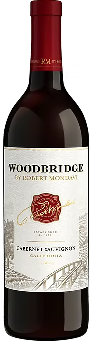
An established wine brand with a recognizable heritage. The challenge: explore how its identity could feel more distinctive and relevant without losing the familiarity people valued.
- My contribution
- Creative direction
- Collaboration
- Affinity Creative Group
- The scope
- Brand expression
- Packaging direction
- Research-informed exploration
The challenge
A wine label has to carry provenance, personality, and a reason to choose—all in a small space. For an established name, that means balancing continuity with a meaningful step forward.
The approach
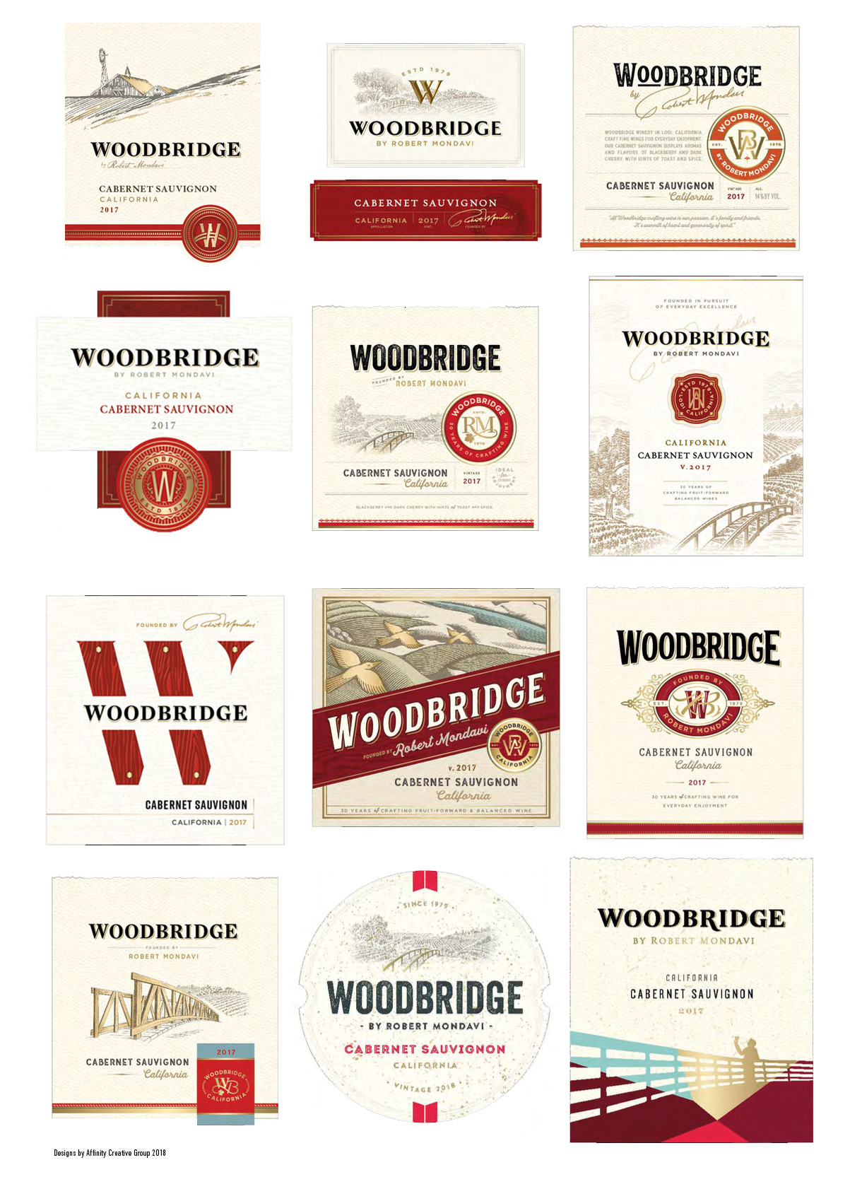
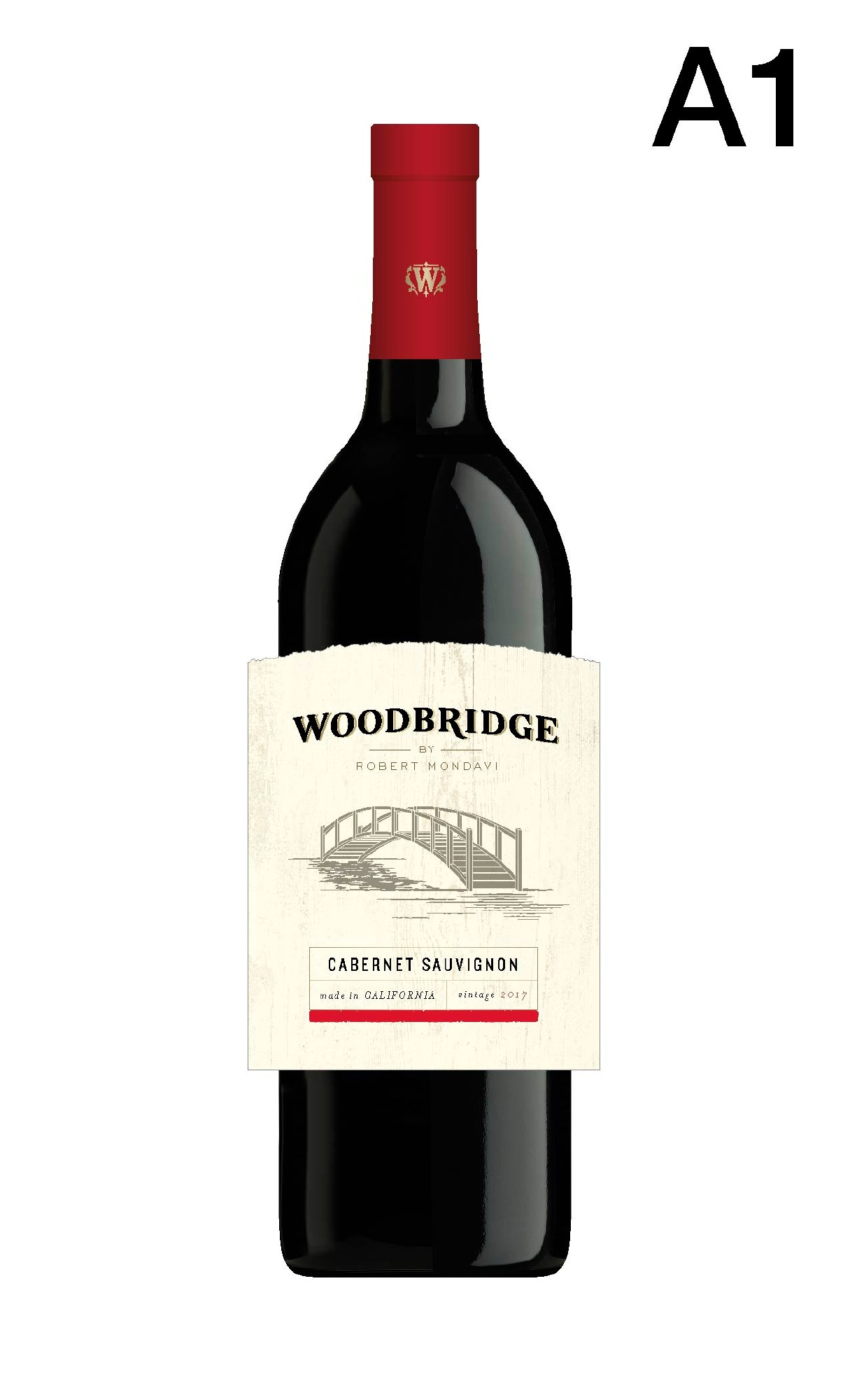
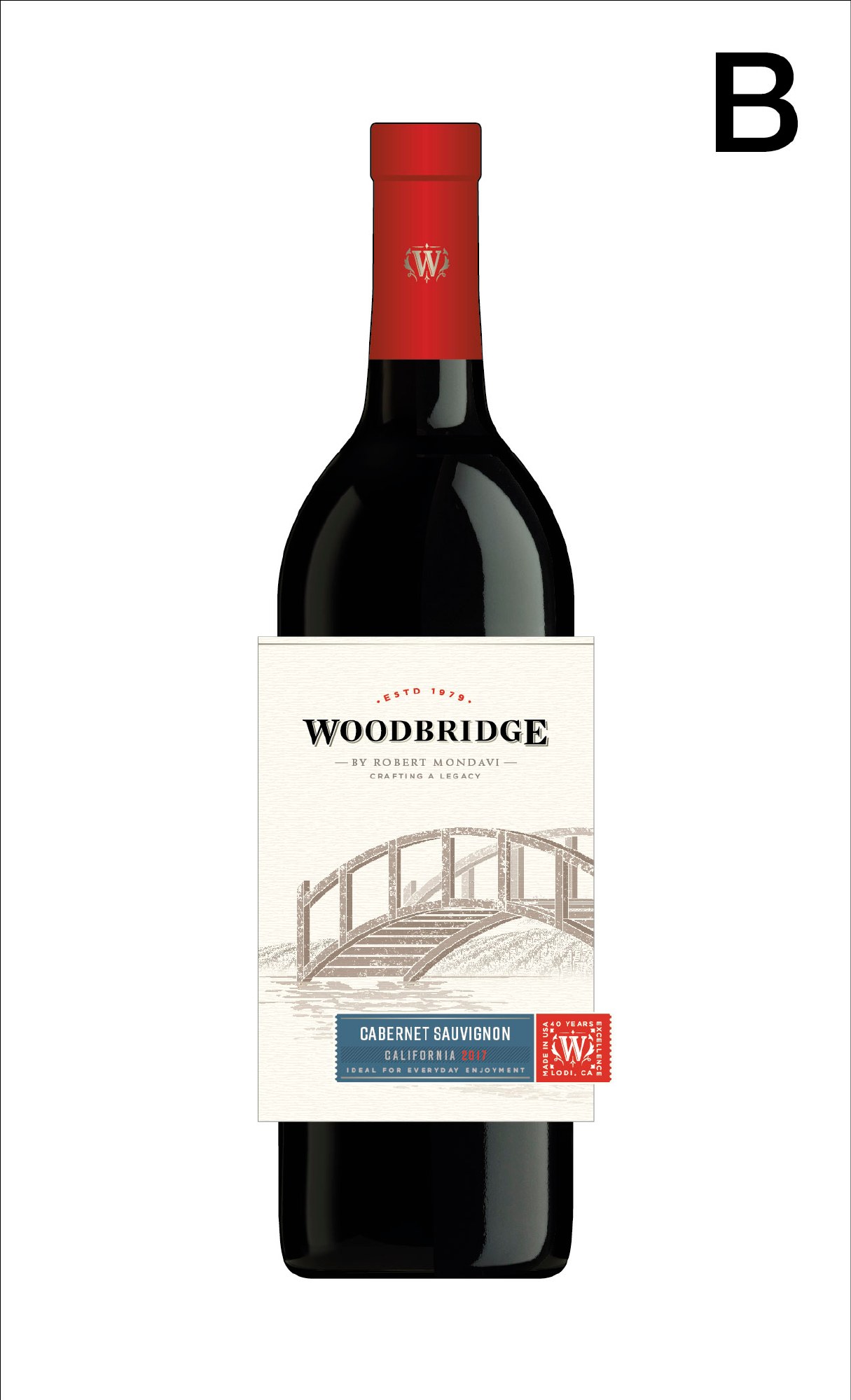
Explore different ways to organize the brand’s heritage: the bridge, the name, the typography, and the relationship between label and bottle. Research and focus-group feedback informed the development, helping turn visual options into a considered conversation about the brand.
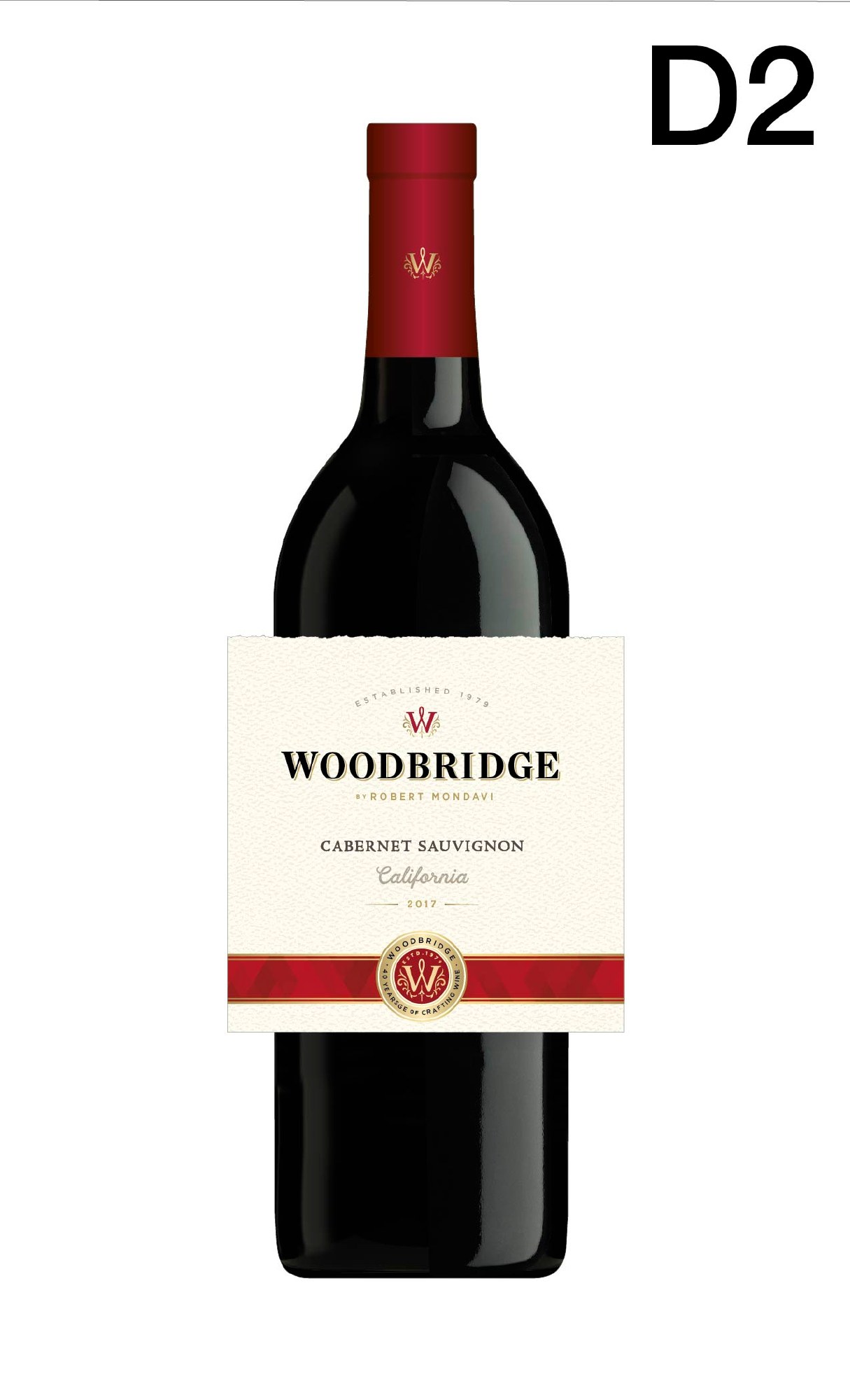
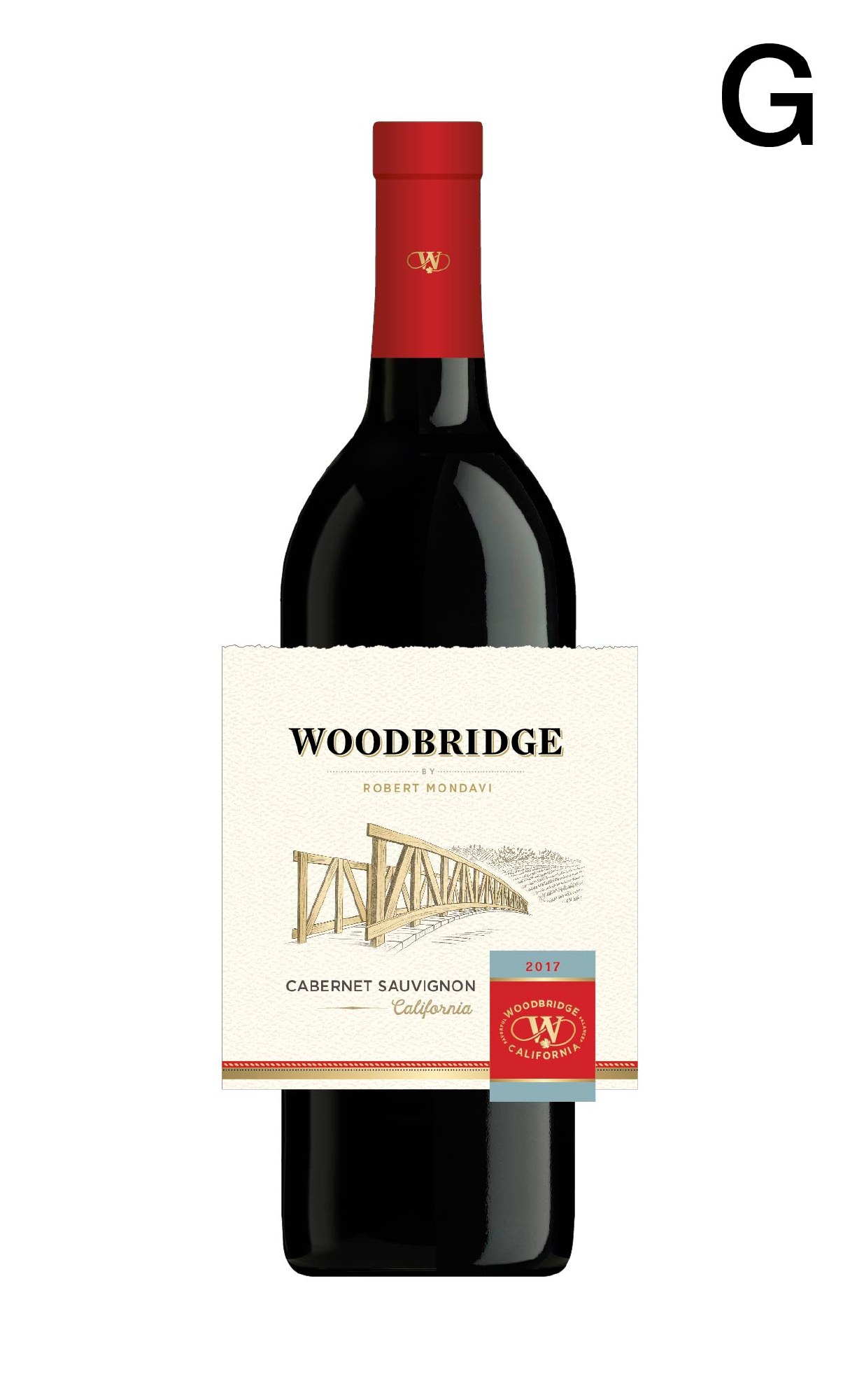
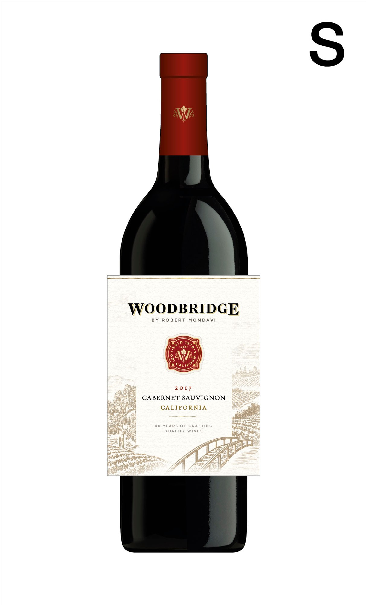
Project credits
Creative direction: Gerardo García-Jurado. Design development: Affinity Creative Group. This gallery presents selected label explorations and refinement directions; it does not imply that every shown design was produced.
What could your brand become?
Big-brand experience, focused on your business. We can start with one challenge, two connected services, or the complete journey.